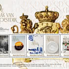
New Dutch Design - Greetings

| Sheetlets |

| First Day Cover |

| Presentation Pack |
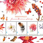
On 22 April 2025, PostNL will release New Dutch Design - greetings, the first stamp sheet in this new series. The New Dutch Design series showcases the work of the next generation of Dutch graphic designers. The stamps were designed during the 2023-2024 academic year by second-year Graphic Design students at ArtEZ in Zwolle, in collaboration with Nicole Uniquole. The stamps bear the denomination “1” for mail up to 20 grams within the Netherlands.
The New Dutch Design series, a successor to the Typically Dutch series, is dedicated to the theme of “celebration,” expressed through colour and form. After brainstorming the theme, the students decided to explore it by focusing on different rituals. The 22 April release features a sheet of 6 special stamps with 2 unique designs centred around the ritual of greetings.
Earlier this year, on 17 February, the first sheet in the New Dutch Design series was issued, focusing on coffee and tea rituals. Later this year, the series will include stamps on the rituals of making music (11 August) and dancing (22 September). The price for a sheet of 6 stamps is €7.26.
SUBJECT
Greetings are an essential aspect of social interaction. The way people greet each other often depends on the context, social status, and physical distance between them. In the Netherlands, greeting rituals are typically informal, but nuances exist depending on the situation and the people involved.
Using greetings as a social ritual in the Netherlands reflects the country’s emphasis on egalitarian values. Exaggerated displays of politeness, such as kneeling or bowing—common in some other cultures—are rarely seen. Instead, the Dutch focus on equality and practicality, which is evident in their greeting style: informal, direct, and straightforward. One of the most common greetings in the Netherlands, both in formal and informal settings, is the handshake. During the COVID-19 pandemic (2019-2022), handshakes were strongly discouraged, leading to temporary alternatives such as fist bumps, nods, or elbow touches. In more informal situations, such as among friends and family, giving kisses on the cheek is customary, particularly during special occasions or after a long absence. This practice typically involves women greeting each other or men and women exchanging kisses, while it is less common between men. However, this ritual varies by region and personal preference.
For a long time, giving three kisses was considered a deeply rooted tradition in the Netherlands. However, research indicates that this practice is becoming less common among younger generations, who are more likely to opt for one or two kisses or a simple hug.
Sources: F. Driessen, Nederlandse begroetingsrituelen in verandering (Dutch Greeting Rituals in Transition, 2019) | G. Hofstede, Culture’s Consequences: Comparing Values, Behaviors, Institutions and Organizations Across Nations (2011) | E. Snoeijer, Nederlandse omgangsvormen (Dutch Etiquette, 2020)
DESIGN
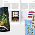
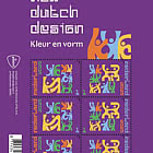
The New Dutch Design - greetings stamp sheet features 6 special stamps in a horizontal format with 2 distinct designs. The 3 stamps on the left depict illustrations of figures greeting each other: a child petting an excited cat and two figures, seen from behind, embracing with their arms around one another. The scarf of the figure on the right flutters in the wind and extends onto the 3 stamps on the right side of the sheet.
On these right-hand stamps, an illustration shows a side view of two figures embracing, with the figure on the right leaping into the arms of the figure on the left. A few flowing lines on the stamps suggest a windy day, further emphasized by tree leaves swirling from one stamp to the next. The colours used for the figures and their clothing are drawn from the palette for the entire New Dutch Design series.
The country designation “Nederland” and the year 2025 alternate between the left and right sides of the stamps. The value indication “1” is placed in the bottom right or left corner, while the sorting mark is positioned in the top right or left corner. On the sheet border, the illustration of the two embracing figures is repeated alongside the title of the issue. The same illustration continues off the bottom left of the sheet. Against a beige background on the border, tree leaves and the wind lines reappear, tying the design together.
TYPOGRAPHY
Two typefaces were used for the text on the New Dutch Design - greetings stamps. The first is Vier, designed by Maureen Ketting in 2024 in collaboration with her fellow Graphic Design students at ArtEZ, University of the Arts, Zwolle, specifically for the New Dutch Design series. The second is LTR Limited Grotesque, created in 2024 by type designer Erik van Blokland for LettError in The Hague.
DESIGN – SERIES
Curator Nicole Uniquole is well-known for organising major art and design exhibitions at historical locations. On behalf of PostNL, she guided the ArtEZ instructors and students throughout the design process for the New Dutch Design stamp series. “We began the project with an inspirational visit for all the students to the National Archives, where the design processes of nearly all Dutch stamps are documented. We even ventured into the archives’ basements, where original working drawings by renowned figures such as Piet Mondrian, Hendrik Werkman, and Anton Beeke were brought out. You could see how amazed the students were when they realised their work might one day be preserved there as well. In our approach to this series, the primary goal was to ensure the stamp sheets would form a cohesive collection, while giving the students full freedom to express their creativity. This creates a healthy tension. The idea was to work with a clear and strong visual language so the message comes across immediately. As Anton Beeke once said about poster design: the design should hit you—bam—like a punch in the face. That grabs your full attention.
The result is a series of ritual-themed stamps with a positive and optimistic appearance, characterised by clear forms, earthy colours, and a unifying typeface. This positive spirit aligns perfectly with the purpose of sending mail: thinking of one another and showing care for others.”
The design of the New Dutch Design stamp series is the result of an educational project within the Graphic Design programme at ArtEZ in Zwolle. PostNL had previously collaborated with Nicole Uniquole and ArtEZ on two stamp designs: The Compliment (2023) and 250 Years of King William I (2022). Marijke Meester, head of Graphic Design at ArtEZ, was closely involved in the creation of the New Dutch Design series. “This new project fits perfectly within our policy of working with external partners and giving students the freedom to experiment. The design of New Dutch Design involved 20 second-year students working in groups with changing compositions under the guidance of instructor Anje Jager. The students themselves brainstormed and connected the theme of ‘celebration’ to rituals as a common thread. We then adopted this as an overarching semester theme within the programme. Rituals are universal—they connect us and are part of what makes us human.”
DESIGN - GREETINGS
The New Dutch Design - greetings stamp sheet was created by students Famke Ruiter, Lisa van den Broek, Renée Wiersma, and Sylvana Versteege, while the grid (typography and layout) was designed by their fellow students Chantal Idzerda, Jolijn Bos, and Maureen Ketting. As with all stamp designs for the New Dutch Design series, this project was the result of a collaboration between ArtEZ students and curator Nicole Uniquole. The design was completed during the 2023-2024 academic year by second-year Graphic Design students. At ArtEZ, the students were guided by Marijke Meester (Head of Graphic Design) and Anje Jager (Graphic Design instructor).
Warmth
Renée Wiersma and Sylvana Versteege finalised the New Dutch Design - greetings stamp sheet on behalf of their team. Together with their fellow students, they explored various ideas related to the theme of warmth. “We spent a lot of time considering how to connect warmth or fire to the theme of rituals,” explains Sylvana Versteege. “This included ideas like roasting marshmallows together or baking cakes. What fascinated me personally was how warmth arises when we acknowledge one another’s presence through a greeting. It’s something we all do—even with that typically Dutch nod that says: ‘I see you, I know who you are, and now I’ll carry on with what I was doing.’
In my approach, I focused on the ritual of warmer greetings involving touch.”
Unanimous choice
All the ideas and accompanying sketches were thoroughly discussed in the group. The unanimous decision was to focus on the ritual of greetings, based on a sketch by Sylvana Versteege.
“With greetings, you can go in so many directions,” says Renée Wiersma. “From the nod we mentioned to a group hug, from handshakes, hugs, and embraces to the way you greet your pet, for instance. Sylvana’s sketch already included the key elements now featured on the stamps. There were pairs greeting each other, the scarf was already fluttering, and the wind and leaves were also present.”
Breaking the pattern
The New Dutch Design - greetings stamps feature illustrations of three pairs greeting each other in different ways. The two large figures on the left-hand stamps, embracing each other, have been part of the design since the early stages.
“At first, they were an older couple,” explains Sylvana Versteege. “But over time, they became slightly younger. You usually see the traditional pairing of a man and a woman in illustrations like this. I wanted to break that pattern, so they became two women.
They were deliberately drawn from behind. That’s not something you often see, but it allowed me to really emphasise their arms, which, to me, held the warmth of the greeting. It also made the scene more intimate. An added benefit was that I could showcase the scarf more prominently.”
Movement
The illustration of the child and the cat was conceptualised early in the process, but the two figures enthusiastically embracing one another came later. Renée Wiersma explains how this evolved: “It happened during the phase when all the student groups, who had been working on their individual stamps, came together to ensure the designs would form a cohesive series. This was achieved by adopting the same typography and colour palette. We were also inspired by the sense of movement in the dance and music stamps. The child with the cat and the women embracing are relatively static. That’s why, for the stamps on the right, we created the scene of the pair exuberantly hugging. It adds more liveliness to the stamp sheet. By depicting people from different generations, we also highlight that greetings aren’t limited to any particular age group. Everyone greets one another in some way.
The illustrations were designed to be as neutral and inclusive as possible, just like the other stamps in the series. This makes the designs as accessible as possible.”
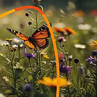
Autumn
From the earliest sketches, it was clear that the meetings and greetings on the stamps would take place in the autumn. “The wind has been part of the design concept from the start,” says Sylvana Versteege. “It’s autumn—you can see it in the clothing, the wind, and the falling leaves. I always associate warmth with autumn, and it’s also the season when people often seek out warmth. Whether it’s by wearing a scarf or through warm greetings between people, there’s something extra cozy about it in the fall. The wind and leaves also provided an opportunity to tie the two stamp designs together. The scarf flows across the perforations, creating continuity. The colours are reminiscent of autumn, with warm tones of orange and yellow. That wasn’t the case from the beginning, though. The first sketches were in black, red, and baby pink, which gave a completely different vibe.
When we collectively decided to use the same colour palette for all the stamps in the series, many possibilities opened up. It all came together naturally after that.”
Finding Inspiration in each other
The introduction of the new colours also brought a change in the illustration style. “This was tied to the desire to bring the different designs in the series closer together,” explains Renée Wiersma. “At first, we worked with line drawings, but later we transitioned to using solid shapes. This allowed us to incorporate much more colour into the design. It was a beautiful process, and despite the change in style, we managed to maintain the original concept. This was possible because everyone was so deeply invested in the design. It truly was a group effort, where we drew inspiration from each other.”
DESIGN – THE GRID
In stamp series design, the different releases usually share certain features, such as typography or a common layout framework. For the New Dutch Design stamp series, a separate team of students was responsible for creating this ‘grid,’ as Maureen Ketting explains. She, along with Jolijn Bos and Chantal Idzerda, was part of the grid team. “Our task was to ensure uniformity across the various stamps, such as the positioning of visual elements on the stamps and the sheet borders. Using books from the library, we first studied various examples and then started sketching—each of us individually—while the other teams were busy designing their stamps.”
Custom typeface
To give the series a distinctive character, the grid team designed a custom typeface. “We each worked on our own design,” says Jolijn Bos. “After consulting with the class—and with approval from the instructors and PostNL—Maureen’s typeface was chosen. Her typeface best fit the assignment.
She had created a 4 x 4 grid to literally reflect the theme of ‘celebration’ in the dimensions. The typeface features flowing shapes that seem to come together, just like people do when they gather to celebrate. That’s why the typeface was named Vier (‘Four’ in Dutch).
The second typeface, LTR Limited Grotesque by Dutch type designer Erik van Blokland, provides a playful counterbalance to the blocky forms of Maureen’s design.”
Sheet border guidelines
The stamps feature the text “Nederland” and “2025” displayed vertically, alternating between the left and right sides. Maureen Ketting explains: “This gave the teams as much space as possible for their designs, ensuring that the illustrations and typography wouldn’t clash. Throughout the process, we shared our proposals to gather feedback and ensure that our approach aligned with the design ideas of the other teams. If necessary, either they adjusted their ideas, or we adjusted ours.
We also addressed the requirements for the sheet border, such as the placement of the title, logo, and mandatory information. Each team was responsible for the remaining details of their sheet borders.
At the end, we considered adding a background pattern to the sheet border, but it ended up looking too busy, so we decided against it.”
Short Stories
The four New Dutch Design releases this year each have their own unique character but are clearly connected, thanks to the grid team’s work and the shared colour palette. “There are also common elements in the designs,” says Jolijn Bos. “For example, each stamp sheet features a circle as a character’s head. The illustrations can be seen as small stories that are connected. For instance, a student at ArtEZ wakes up in the morning, drinks coffee or tea, goes out, greets friends and acquaintances, makes music with others in the afternoon, and dances in the evening.”
About the Students
The following students contributed to the New Dutch Design stamp designs during the 2023-2024 academic year, in their second year of studying Graphic Design at ArtEZ in Zwolle: Chantal Idzerda (Putten, 2003), Famke Ruiter (Hellendoorn, 2001), Jolijn Bos (Oss, 2002), Lisa van den Broek (Nuenen, 2000). Maureen Ketting (Almere, 2002), Renée Wiersma (Sneek, 1999), Sylvana Versteege (Deventer, 2000).
About Marijke Meester
Marijke Meester (born in Purmerend, 1964) has been Head of Graphic Design at ArtEZ, University of the Arts in Zwolle, since 2017. In 1992, she founded Meester Ontwerpers, a design agency in Amsterdam with extensive experience in strategy, communication, and complex challenges. The core team consists of Marijke Meester and Soejon Pet, complemented by a flexible network of professional communication and design specialists.
Meester studied at the Amsterdam University of Applied Sciences (art and crafts education) and earned her degree in Graphic Design at the Utrecht School of the Arts (HKU), graduating cum laude.
About Nicole Uniquole
Nicole Uniquole (born in Amersfoort, 1968) is known for creating acclaimed exhibitions at historical locations, where she combines contemporary design with 17th-century art. Some of her notable exhibitions include Design & Dynasty, 250 Years of Court Life of the Oranien-Nassau Family in Fulda (2022), Royal Showpieces at Het Loo Palace (2014/2015), Dutch Design – House of Orange at Oranienbaum Palace (2012). She is also the founder of Masterly – The Dutch Pavilion, an annual feature at the Salone del Mobile design fair in Milan. In 2021, she won Harper’s Bazaar’s Woman of the Year public award for her tireless dedication to contemporary art. Currently, Uniquole serves as Creative Director of Soestdijk Palace. Her role there has already resulted in exhibitions such as Women of Soestdijk (2023) and Brilliance at Soestdijk (November 2024 – March 2025).
Netherlands - Recommended stamp issues
WOPA+ recommended stamp issues

| Avatar - Fire and Ash |
| Issued: 03.12.2025 |
| ›New Zealand |
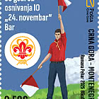
| 50th Anniversary of the Founding of the 24th November Bar Scout |
| Issued: 24.11.2025 |
| ›Montenegro |
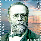
| Krisjanis Valdemars |
| Issued: 02.12.2025 |
| ›Latvia |

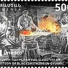
| Sign Language - Good |
| Issued: 02.12.2025 |
| ›Bosnia and Herzegovina - Republic of Srpska |

| In Memory of the Fallen and Murdered on October 7, 2023 |
| Issued: 08.10.2025 |
| ›Israel |
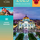
| Annual Collection Folder (New York) |
| Issued: 05.12.2025 |
| ›United Nations |
| Year Set |
| Issued: 24.11.2025 |
| ›Isle of Man |
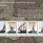
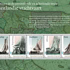
| Shipping in the 17th and 18th Centuries - Peat Shipping |
| Issued: 05.12.2025 |
| ›Netherlands |