NovelGiants

| Sheetlets |

| First Day Cover |

| First Day Cover |

| Presentation Pack |

| Presentation Pack |
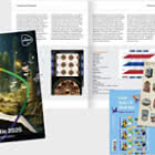
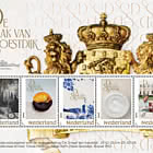
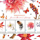
On 22 April 2025, PostNL will issue the stamp sheet NovelGiants, featuring 10 stamps in 10 unique designs. The stamps showcase portraits of 10 notable Dutch authors: Kader Abdolah, Abdelkader Benali, Peter Buwalda, Adriaan van Dis, Jessica Durlacher, Bregje Hofstede, Mensje van Keulen, Astrid Roemer, Manon Uphoff, and Tommy Wieringa. The title of this stamp issue is derived from the NovelGiants project, an initiative by journalist Frénk van der Linden and photographer Fjodor Buis aimed at combating declining literacy in the Netherlands. The stamp sheet was designed by graphic designer Lex Reitsma from Haarlem. The price of the NovelGiants sheet with 10 stamps is €12.10.
SUBJECT
NovelGiants is an initiative by journalist Frénk van der Linden and photographer Fjodor Buis to combat declining literacy in the Netherlands, especially among young people. The project involves numerous organisations, including Dutch libraries, the Lezen en Schrijven (Reading and Writing) Foundation, and the Libris bookshop chain. A special youth council has been established, and young influencers are actively involved. On 19 April 2025, NovelGiants kicked off with the first in a series of events held in 52 libraries, where 52 writers will be interviewed by secondary school students. The project is accompanied by a book featuring interviews by Frénk van der Linden with these same 52 Dutch authors. Fjodor Buis took portrait photographs of the writers, which are included in the book and displayed in a travelling exhibition. Accessible podcasts about the 52 writers will be distributed via all major podcast platforms. Additionally, public campaigns will be held in Libris stores. To further boost awareness of NovelGiants among young people, an intensive social media campaign is underway. Free masterclasses on interview techniques and photography are offered to secondary school students and media students. On a local level, small-scale literary festivals will be organised in collaboration with libraries and other cultural institutions.
Out of the 52 participating authors, the following 10 are featured on the NovelGiants stamps: Kader Abdolah, Abdelkader Benali, Peter Buwalda, Adriaan van Dis, Jessica Durlacher, Bregje Hofstede, Mensje van Keulen, Astrid Roemer, Manon Uphoff, Tommy Wieringa.
DESIGN
The NovelGiants stamp sheet features black-and-white portrait photographs of 10 renowned living Dutch authors. These portraits, in a vertical format, are accompanied by a hand-drawn depiction of a book on each stamp. The photos are integrated into the illustration, appearing as though they are the book’s cover. The illustration extends onto the adjacent stamps and the sheet border, creating a cohesive design. In the upper-left corner of each stamp, most of the typography is concentrated: the author’s name, the country designation, the year, and the value indication “1.” The sorting mark is positioned in the bottom-right corner. The tabs beneath the stamps feature quotes from the authors about reading and writing, with the background colour of each tab derived from the colour of the author’s name. On the left-hand side of the sheet border, the title NovelGiants is displayed, alongside a QR code linking to the project’s website (romanreuzen.nl). The stamps were designed by graphic designer Lex Reitsma from Haarlem, with photography by Fjodor Buis and quotes selected by journalist Frénk van der Linden.
TYPOGRAPHY
The typography for the NovelGiants stamp sheet utilises the Bodoni Old Face typeface by Berthold, based on the 1798 Bodoni type by Giambattista Bodoni and reimagined by German type designer Günter Gerhard Lange (1921-2008). For the denomination “1,” the sans-serif font Akkurat was used, designed by Swiss type designer Laurenz Brunner and released by Lineto Type Foundry in 2014.
DESIGNER
The NovelGiants stamp sheet was designed by graphic designer Lex Reitsma, who worked with 10 portraits and quotes from Dutch authors. “When I was approached to design the stamps, the selection of authors and quotes had already been made by Frénk van der Linden and Fjodor Buis, the initiators of the NovelGiants project,” says Reitsma. “This included the balanced division of five men and five women, as well as the choice of five full-body photographs and five classic portraits. That balance was already in place. I started by combining the 10 chosen portraits with their respective quotes in various ways. While it looked appealing, I wanted to go a step further to better convey the essence of books and literature.”
Books on display
Reitsma added an extra layer to the design by incorporating an identical illustration of a book on each stamp. “These are all novelists, so their connection to literature and books is clear. The stamp sheet is laid out in two rows of five stamps, and I wanted to evoke the feeling of standing in a bookshop, looking at tables displaying these authors’ works. The top-right corner of each book illustration extends onto the next stamp and the sheet border, symbolising that there are, of course, many more books beyond these 10. The authors on the stamps represent all their fellow writers.
I’ve used this continuation effect in previous stamp designs, such as the stamps for the Red Cross and the issue featuring a poem by Jan Wolkers.”
Classic novel
For the book illustration, Reitsma used various books from his own collection as references. “I photographed the best examples and recreated them on the computer, naturally adjusting their format and thickness to resemble a classic novel. The photos were taken by Fjodor straight-on, while the book was positioned at an angle. This creates a visual tension, a subtle dissonance, between the three-dimensional illustration of the book and the classic portrait photographs. It grabs attention. Additionally, this approach ensures that viewers don’t mistake the image for the cover of an actual book—because, of course, it’s not.”
Soft tones
Each author’s name was assigned its own colour, with the background colour of the tab featuring the corresponding quote derived from this shade. “These are soft tones,” explains Reitsma. “They contrast beautifully with the nuanced greys of the black-and-white photographs. I selected the colours intuitively—red tones are more often associated with women, earthy colours with landscapes, and azure blue with a sea in the background. The colours on the tabs are slightly muted, which also enhances the readability of the text.
Fjodor suggested the order of the authors, aiming for a balanced composition with a mix of close-up and more distant shots. The typography features a classic serif font. Bodoni Old Face is a sturdy, somewhat stern typeface, yet it feels fresh. As a counterpoint, I used the sharp ‘1’ from the Akkurat typeface for the denomination.
My goal was to create a clear and striking design—it shouldn’t feel cluttered or overly complex. What I once said about a poster also applies to the design of a stamp: it should be an exclamation mark, not a question mark.”
INTERVIEWER
Journalist Frénk van der Linden conducted interviews with 52 authors for the NovelGiants project, including the 10 writers featured on the stamp sheet. For the stamps, each author wrote a concise summary of their vision on reading and writing. “One of the most challenging tasks in this project was selecting 10 authors from the 52 for the stamps,” says Van der Linden. “We aimed to create as diverse a group as possible in terms of age, gender, background, types of books, and target audiences. We received significant support from various organisations for this project. Like us, they understand how crucial it is to encourage reading, especially among young people.
The essence of humanity lies in storytelling. Writers excel at this, and through their books, we meet other characters who, like us, experience all sorts of things. Reading about these characters fosters understanding and empathy, which is what connects us as humans. The decline in reading—especially among young people—is, therefore, deeply tragic, particularly in today’s world of increasing individualism and polarisation. During the interviews, I could see how much this issue resonates with the authors themselves. Writers are also readers. A key theme in the interviews was which books were significant to them in their youth. These stories are both moving and inspiring, and you can hear them in the podcasts. They also talk about how these books encouraged them to find their own path and voice.”
PHOTOGRAPHER
In the three years leading up to the launch of the NovelGiants project on 19 April 2025, Fjodor Buis photographed 52 Dutch authors. “The idea started simply as a photo book,” explains Buis, “but over time, it expanded into the comprehensive project it is today. Projects like this, which I often work on, always begin with finding the right photographic approach. The series needed enough consistency to feel unified but also enough variety to avoid monotony. For each author, I created two different portraits: a classic close-up shot taken indoors in natural daylight and a full-body shot taken outdoors. For the outdoor portraits, we chose locations that held meaning for the authors. Sometimes near water—it is the Netherlands, after all—but also in dunes, forests, meadows, or other quintessentially Dutch landscapes. The key was to avoid the distractions of people or inanimate objects like cars or bicycles. Shooting outdoors is always exciting because the unexpected inevitably happens. For instance, I photographed Tommy Wieringa behind his house, and just as we started, his chickens escaped. That’s why he’s holding one in his arms in the portrait. I chose black-and-white photography because it allows the lighting and composition to take centre stage. The authors were photographed in their own surroundings rather than in a studio. Studio lighting can be distracting, and natural daylight provides more variation because it’s never the same. In each portrait, the authors are looking straight into the camera, which creates a sense of intimacy. While authors are often photographed, it’s usually tied to the release of a new book. These sessions were about them as individuals, about their craft and their responsibility as writers. That gives the photographs a timeless quality. I noticed that they recognised this, and it motivated them to invest significant time and effort into the process.”
About Lex Reitsma
Lex Reitsma (born in Delden, 1958) is a graphic designer and filmmaker. He studied graphic design at the Gerrit Rietveld Academy in Amsterdam from 1978 to 1983 before establishing himself as an independent designer. Reitsma created posters for the Dutch National Opera for more than 20 years and worked for prestigious clients such as the Stedelijk Museum, PTT Art and Design, Centraal Museum Utrecht, Museum Overholland, and Museum Boijmans Van Beuningen.
As a filmmaker, Reitsma is known for his reflective documentaries on notable figures, including book designer Irma Boom (2018), graphic designer Wim Crouwel (2019), portrait photographer Koos Breukel (2021), and architect Gerrit Rietveld (2024). For the publishing house De Verbeelding, Reitsma designed more than 20 photography books, including Aarsman’s Amsterdam (1992) by Hans Aarsman and Hollandse Velden (1998) by Hans van der Meer, which are among his best-known works. For the art historical agency D’ARTS, he created books such as De Amstel (2002) by Peter-Paul de Baar and others, and De Grachten van Amsterdam (2013) by Koen Kleijn. One of Reitsma’s most notable works is the 840-page Oeuvre Catalogue of Theo van Doesburg (2000).
For PostNL, Reitsma previously designed stamps for the following issues: Privatisation of PTT (1989), Red Cross (1997), 100 Years of KVGO (2001), Euro Stamps (2001), and Card Weeks (2007), which featured a poem by Jan Wolkers.
About Frénk van der Linden
Frénk van der Linden (born in Haarlem, 1957) is a freelance journalist who writes for de Volkskrant, hosts the NTR radio programme Kunststof, and creates television documentaries for various broadcasters. Since the late 1970s, he has published countless interviews and reports. The jury that awarded him the Prize for Dutch Newspaper Journalism in 1998 described his work as “textbook examples of achievements at the highest level.” In addition to his media work, Van der Linden moderates debates and conferences, and hosts webinars and digital talk shows. In early 2024, his book Hoe besta je na? (How to Live On?), featuring interviews about coping with the loss of a loved one, was published. His most recent work, NovelGiants, featuring text by Van der Linden, will be released in 2025 by Luitingh-Sijthoff.
About Fjodor Buis
Fjodor Buis (born in Bussum, 1968) has worked as a photographer for prominent media outlets since the late 1990s. His clients include Atlas Contact Publishers (author portraits), Adformix (CEO portraits), and various magazines such as Golfers’ Magazine, Bicycling, Runner’s World, Filmvalley, Quote, Oor, and Autovisie. Buis is known for his portrait series of Trabant owners, notable residents of Haarlem, Marten Toonder, and female singer-songwriters. One of his most renowned books is Dienaren van de kroon (Servants of the Crown, 2015), which features portraits of 114 (former) ministers and prime ministers and was accompanied by an exhibition. His latest book, NovelGiants, featuring his photography, will be published by Luitingh-Sijthoff in 2025.
Netherlands - Recommended stamp issues
WOPA+ recommended stamp issues
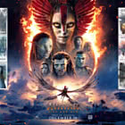
| Avatar - Fire and Ash |
| Issued: 03.12.2025 |
| ›New Zealand |
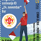
| 50th Anniversary of the Founding of the 24th November Bar Scout |
| Issued: 24.11.2025 |
| ›Montenegro |
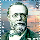
| Krisjanis Valdemars |
| Issued: 02.12.2025 |
| ›Latvia |
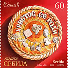

| Sign Language - Good |
| Issued: 02.12.2025 |
| ›Bosnia and Herzegovina - Republic of Srpska |

| In Memory of the Fallen and Murdered on October 7, 2023 |
| Issued: 08.10.2025 |
| ›Israel |
| Annual Collection Folder (New York) |
| Issued: 05.12.2025 |
| ›United Nations |
| Year Set |
| Issued: 24.11.2025 |
| ›Isle of Man |
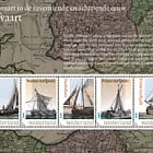
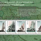
| Shipping in the 17th and 18th Centuries - Peat Shipping |
| Issued: 05.12.2025 |
| ›Netherlands |