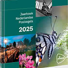
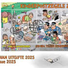
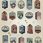
Children’s Welfare Stamps
| Sheetlets |
| First Day Cover |
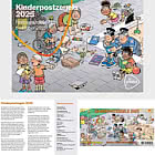
| Presentation Pack |
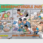
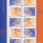
On 6 October 2025, PostNL will issue a new sheet of Children’s Welfare Stamps with a denomination of 1 for domestic mail within the Netherlands. The sheet features five stamps—one large and four smaller ones—designed by Jan van Haasteren, the most famous Dutch illustrator of jigsaw puzzles. The design reflects the campaign theme: Together against loneliness. As always, the stamps will be sold door-to-door by primary school pupils in the autumn. The price for a sheet of 5 stamps is €9.80, including a surcharge of €0.65 per stamp.
FUNDRAISING
Since 1924, PostNL has issued Children’s Welfare Stamps to raise funds for projects that strengthen the resilience of vulnerable children. This is achieved through a surcharge, currently €0.65 per stamp. All proceeds from the surcharge go to projects supported by the Children’s Welfare Stamps Foundation. This independent foundation works to provide equal development opportunities for children in the Netherlands and abroad. To make this support possible, the foundation organises the annual Children’s Welfare Stamp campaign, which has been part of the Netherlands’ Inventory of Intangible Cultural Heritage since 2017.
CAMPAIGN
From 24 September to 1 October 2025, 125,000 pupils from years 7 and 8 will sell the Children’s Welfare Stamps door-to-door. The 2025 campaign theme is Together against loneliness. One in ten children struggles with loneliness daily. Research shows that in every primary school class, two to three children feel lonely often or always. Some children are especially vulnerable—those growing up in poverty, receiving youth care, or with a parent suffering from addiction or mental health issues. Together with schools, children, and the rest of the Netherlands, the Children’s Welfare Stamps Foundation is taking action to combat severe loneliness among children. Support includes safe spaces to meet others, access to sports and play, and the help of a buddy who listens and offers companionship.
HISTORY OF CHILDREN'S WELFARE STAMPS
A royal decree in 1924 authorised the state to issue stamps with a surcharge “for disadvantaged children.” Since then, the stamps have evolved with society, reflecting the spirit of the times—from the stylised child’s head between angel figures in the first design to the colourful and cheerful stamps of 2025. Initially, volunteer committees sold the stamps. In 1948, a teacher proposed a trial where pupils sold the stamps, which proved so successful that it became a nationwide practice in 1949. Thus began the Children’s Welfare Stamp campaign as we know it today. Each year, over 3,000 schools and 125,000 children participate. Over the decades, many special stamps have been issued, including photographs by Prince Claus of his three sons in 1972 and by Prince Willem-Alexander of his three daughters in 2012. Renowned Dutch illustrators such as Dick Bruna (1969 and 2005), Max Velthuijs (1998), Fiep Westendorp (2016), and now Jan van Haasteren (2025) have contributed designs.
DESIGN
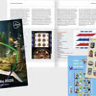
The 2025 Children’s Welfare Stamp sheet features a large illustration by Jan van Haasteren showing children playing in and around a sandpit. The style is typical of the Jan van Haasteren Junior line: cheerful, friendly, colourful, accessible, and playfully absurd. Among the twelve children on the stamps and the sheet border are various animals—a squid, snake, bird, chick, turtle, snail, dog, and rabbit. The children are reading, playing, and enjoying each other’s company. Van Haasteren’s signature humour is everywhere: a plaster on the bin, a spy under a paving stone, a periscope in the sandpit, a loose shoe, a hand on the climbing frame, a shark fin slicing through the sandpit’s edge, and a turtle racing a snail. On the sandpit’s edge are a notebook labelled “post,” two loose envelopes, and a sheet of paper bearing Van Haasteren’s signature and the year 2025.
TYPOGRAPHY
The title and subtitle use Marujo Regular from 2013, designed by Erica Jung and Ricardo Marcin (PintassilgoPrints, Florianópolis, Brazil). The stamp text uses Berliner Grotesk by Erik Spiekermann (1979), the standard font for all Jan van Haasteren puzzles. The lower sheet border features Helvetica, a sans-serif typeface designed in 1957 by Max Miedinger and Eduard Hoffmann for the Haas Type Foundry.
DESIGNER
Jigsaw puzzles are more popular than ever, with hundreds of thousands of enthusiasts in the Netherlands and a growing number of collectors and young fans. Interest surged during the COVID-19 pandemic and remains strong. Jan van Haasteren is the undisputed puzzle king of the Netherlands, and his work is beloved worldwide. This year, he created the illustration for the Children’s Welfare Stamps.
Sandpit as setting
The 2025 Children’s Welfare Stamps feature an illustration set in a sandbox where children are playing together. “The sandbox scene – and the grassy area to the left of it – comes from an advertising drawing I made thirty years ago,” says Van Haasteren. “I used that setting as a starting point and then completely redrew the illustration for the children’s stamps, with new characters. I say new, but most of them will be familiar faces to fans of my puzzles.”
Familiar characters
Van Haasteren draws puzzles in various categories, including the Original series, Expert puzzles, Oldtimers, and the Junior line. Together, they form an adventure series with familiar characters in absurd settings. The Junior line characters are younger versions of the adult figures from the Van Haasteren family. “After all, they were young once too,” he says. “So in the sandpit, you’ll find the father-in-law and mother-in-law from the regular puzzles, but as children. I’m there too, reading a comic on the sandpit’s edge. Even Santa Claus and the tax inspector are present—as marble-playing boys. You can recognise them by what’s beside them: the Santa hat and the budget briefcase, now filled with marbles.”
Everyone joins in
In addition to familiar characters, Van Haasteren drew a few children specifically for the stamps. “Like the boy in the wheelchair playing marbles and the children in the bottom left corner. The boy with the broken arm thinks he can’t join in, but his friend encourages him to play anyway. That’s the motto of the Children’s Welfare Stamps: everyone joins in.”
Absurdity
Van Haasteren’s drawings are known for their humour and absurdity. “I always try to include as much silliness as possible,” he says. “I also like repetition. You’ll see the shark fin pop up everywhere. On the stamps, it’s slicing through the sandpit’s edge. The shark fin dates back to 1975, when I drew my first Baron van Tast comic. The Baron, a fantasist, sees things others don’t—like a shark fin not just in the sea but also on the beach. Later, the Baron even encounters the shark in his hotel room, leading to chaotic scenes.”
Sketching, drawing, colouring
Van Haasteren takes his time with each drawing. “It takes longer now than it used to. I’m older—my mind still works, but my body is slower. Luckily, I don’t work alone. My daughter Saskia handles coordination and communication, and her husband, graphic designer Sander de Rijk, helped with the design. I started with a pencil sketch on paper. Sander scanned it and adjusted the perforations until we were happy with what each stamp showed. After approval from PostNL and the Children’s Welfare Stamps Foundation, I redrew the illustration from scratch. First the drawing, then the outlines in Indian ink, and finally colouring with ecoline, acrylic ink, and watercolour. Sander scanned the drawing again to spot areas for extra detail. Ecoline gives the best colours, but brown and grey are hard to scan, so I use alternatives. I always start colouring with the background to make the characters stand out. The grey tiles were done in acrylic ink, which dries waterproof and allows layering with other paints. Based on the final drawing, Sander completed the stamp sheet design and prepared it for printing.”
Picture puzzle
When Van Haasteren still drew comics, he introduced the “start and end plate”—large illustrations full of characters and scenes from the story. “The drawing for the stamps is similar. You can imagine what else might happen. The subject determines how many characters I draw. If it’s set in a city, I fill the streets with people. For something like the Tour de France, there’s room for landscape. The perspective is always bird’s-eye view, though the height varies. I choose it to fit everything I want to draw.”
Remarkable company
Van Haasteren finds it remarkable that his illustration now appears on stamps. “Some very notable names have come before me: Dick Bruna, Marten Toonder, Jan Kruis and Joost Swarte, for example. I consider it a great honour to now be part of that list. We also make our own stamps, by the way – personalised stamps. I’ve got several of them, all featuring cropped images from existing puzzle illustrations. For instance, one stamp shows the skinny man who eats everything you put on the table, and another features a postman. We always use these stamps on envelopes when we send something to fans, like a little drawing. It’s such fun to turn it into something special – even the envelope.”
About the designer
Jan van Haasteren (born 1936, Schiedam) first attended trade school to train as a house and decorative painter. From 1951 to 1955, he studied advertising illustration at the Academy of Visual Arts and Technical Sciences in Rotterdam (now the Willem de Kooning Academy). Van Haasteren worked at advertising agency Grijseels, publishing house Nijgh & Van Ditmar, the Marten Toonder Studios and Geesink Studio. In 1967, he became a freelance illustrator. Well-known comics from that period include Tinus Trotyl and (with Patty Klein) Uncle Arie on Safari, Sjaak and Uncle George, and Erik and Grandpa. For the comic magazine Pep, Van Haasteren created the strip Baron van Tast. This popular comic, full of absurd situations, led to him designing posters – which in turn launched his fame as a puzzle illustrator. In 2003, Van Haasteren signed a lifetime contract with puzzle manufacturer Koninklijke Jumbo. Hundreds of jigsaw puzzles have since been released under his name, created either by him or in collaboration with the artists from his studio. In 2006, Van Haasteren received the Bulletje en Boonestaak Scale from Het Stripschap (the Dutch comics association). In 2013, he was appointed Knight in the Order of Orange-Nassau. In 2021, the entire Jan van Haasteren Studio (Jan van Haasteren, Rob Derks, Dick Heins) received the P. Hans Frankfurter Prize for their body of work. During the Dutch National Jigsaw Puzzle Championships – held since 2017 using a Jan van Haasteren puzzle – the annual Jan van Haasteren Fan Day also takes place.
Netherlands - Recommended stamp issues

WOPA+ recommended stamp issues

| Avatar - Fire and Ash |
| Issued: 03.12.2025 |
| ›New Zealand |
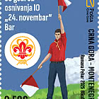
| 50th Anniversary of the Founding of the 24th November Bar Scout |
| Issued: 24.11.2025 |
| ›Montenegro |
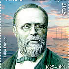
| Krisjanis Valdemars |
| Issued: 02.12.2025 |
| ›Latvia |
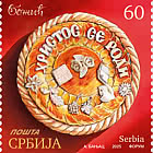

| Sign Language - Good |
| Issued: 02.12.2025 |
| ›Bosnia and Herzegovina - Republic of Srpska |

| In Memory of the Fallen and Murdered on October 7, 2023 |
| Issued: 08.10.2025 |
| ›Israel |
| Annual Collection Folder (New York) |
| Issued: 05.12.2025 |
| ›United Nations |
| Year Set |
| Issued: 24.11.2025 |
| ›Isle of Man |
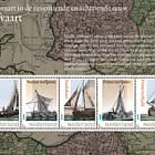
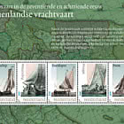
| Shipping in the 17th and 18th Centuries - Peat Shipping |
| Issued: 05.12.2025 |
| ›Netherlands |