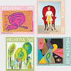
Light and shade
If you sit outside a mountain chalet after a long day of hiking, you might be lucky enough to enjoy the beautiful Alpine glow orange hue of of the sunset. Graphic designer Felix Pfäffli explains the story behind this colour and much more.
Felix Pfäffli, where does the Alpine glow orange come from?
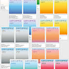
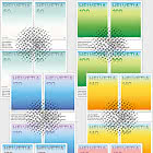
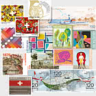
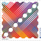
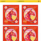
From a colourful stamp set Swiss Post asked me to design. I was thrilled to receive the request, because playing with colours is exactly the kind of thing I love to do. It was also a unique challenge that taught me a lot. I was excited to dive right into the topic.
How did you approach the task?
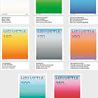
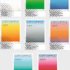
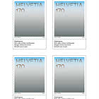
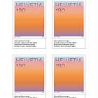
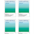
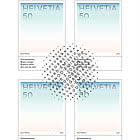
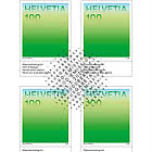
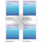
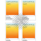
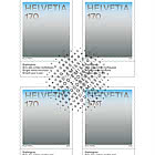
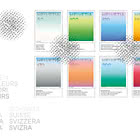
I designed three potential sets. After one of the variants had been selected for the stamps, the detailed work began: I got out my colour swatches and experimented with individual shades and lettering. I quickly realized that it was less about the actual colours than the feelings and memories they evoked. So I also used gradients, which added two or three extra shades to the main colour. I wanted to explore the question of how to bring colour and atmosphere together. All the shades I used are found in nature from the warm evening light in the Alps to the deep turquoise of mountain lakes.
Were there any particular challenges involved?
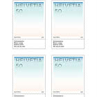
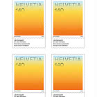
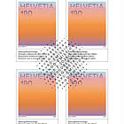
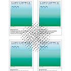
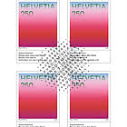
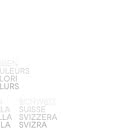
A few! Firstly, the colours themselves or to be more precise, the gradients. It’s not easy to print gradients for special colours. Every stamp is printed in a carefully selected special colour that defines the core colour, while the border colours are produced using the CMYK model. So every stamp is an attempt to translate a feeling into colour. Another challenge was the format: it’s ambitious to convey so much emotion on such a small space. But I was surprised at the amount of impact a tiny printed product can have. It was also important to incorporate the names of the colours in other words, the text. They reflect Swiss values and work in harmony with the actual colours of the stamp to create an impact. To help achieve this effect, the names are printed in the four national languages on the white lower border of the stamp, separated by fine perforations.
What is your personal connection to stamps?
For me, stamps are a lovely reminder of my grandfather: we spent hours sorting stamps together. He taught me a lot and knew everything about the different halftone screens, special colours and any printing errors. That left a deep impression on me.