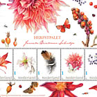
New Dutch Design - Recurring Memories
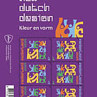
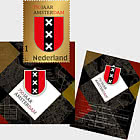
| Sheetlets |

| First Day Cover |

| Presentation Pack |
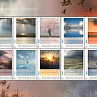
On 16 February 2026, PostNL will issue the stamps New Dutch Design – Recurring Memories, the first stamp sheet this year in the New Dutch Design series. This series showcases work by the next generation of Dutch graphic designers. The design was created during the 2024–2025 academic year by second-year Graphic Design students at ArtEZ in Zwolle, in collaboration with Nicole Uniquole. The stamps bear denomination 1 for mail up to 20 grams within the Netherlands.
The New Dutch Design series is once again dedicated to the theme of ‘celebration’, expressed through colour and form. Each year, second-year students are free to interpret this theme in their own way. For the 2025 stamps, students explored the theme through various ‘rituals’. For 2026, the new group of students chose the call to ‘make it bold’. With 4 different stamp designs, they invite us to pause, let go, remember, and above all celebrate life.
The first issue on 16 February, a sheet of 6 special stamps in 2 designs, is titled Recurring Memories. Later this year, the series will include Taste the Atmosphere (11 May), Glow of the Moment (10 August), and Echo of the Party (28 September). Each stamp bears denomination 1 for mail up to 20 grams within the Netherlands. The price for a sheet of 6 stamps is €8.40.
DESIGN
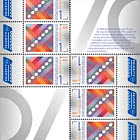
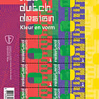
The stamp sheet New Dutch Design – Recurring Memories is dominated by a large, full-bleed graphic illustration. The image combines a scanned and highly enlarged strip of photographic film with a pattern of concentric circles. This pattern appears in various places and intersects the film strip in different ways. The sheet contains 6 stamps in 2 designs, each featuring the transport perforation of the film strip in a central role. The perforation appears in different positions, colours, and details in the 2 designs. The scanned edge of the film strip on the right side of the stamps also varies. The 3 stamps on the left are mainly green and orange, while the 3 on the right feature green, blue, and yellow. These colours are repeated on the sheet border. On the left border, the circle pattern appears in purple and orange; on the right, the scanned film edge is shown in light and dark yellow. The colours and patterns of the stamps continue across the top border and the tabs below.
DESIGN PROCESS
The designs for the 4 issues in the 2026 New Dutch Design series were created during the 2024–2025 academic year by second-year Graphic Design students at ArtEZ in Zwolle. All 21 students contributed intensively to the concepts and designs. Curator Nicole Uniquole guided the students on behalf of PostNL, organising inspiration sessions and a visit to the National Archives, where the design process of nearly all Dutch stamps is documented.
The educational project aimed to ensure the stamp sheets complemented each other while giving students full creative freedom. This approach aligns with ArtEZ’s policy of collaborating with external partners and encouraging experimentation. At ArtEZ, students were supervised by Marijke Meester (Head of Graphic Design) and Anje Jager (Graphic Design lecturer). Working as a large design studio, students experienced all aspects of the profession: from briefings, brainstorming, concept development, and client presentations to colour choices, typeface selection, text and layout combinations, and the design of accompanying materials. Initially, students worked in groups to develop concepts and present sketches to PostNL and Nicole Uniquole. Selected concepts were then refined by newly formed groups into preliminary and final designs, while other groups focused on typography, colour palettes, and texts for the accompanying folder.
TYPOGRAPHY
2 typefaces were used for the texts. The first is Vier, designed in 2025 by ArtEZ student Maureen Ketting for the initial New Dutch Design series. The second is Prophet, a sans-serif typeface created in 2016 by Johannes Breyer, Fabian Harb, and Erkin Karamemet of Dinamo Typefaces in Berlin.
NICOLE UNIQUOLE ON THE PROJECT
The design for New Dutch Design – Recurring Memories was created during the 2024–2025 academic year by second-year Graphic Design students at ArtEZ in Zwolle, in collaboration with Nicole Uniquole. Nicole says what she values most is guiding the next generation of graphic designers on a real project: “Not just an exercise on paper, but a PostNL stamp that will soon be in the shops. I love immersing students in real-world design practice: with real deadlines, real choices, real impact. You’re not just a guest lecturer, but also the client. For students, this is both portfolio and practical experience: an official stamp on their CV that the Netherlands will use for postage. Education and practice merge here. You see the new generation grow as their concepts move towards production. Being able to offer that with PostNL is fantastic.”
DESIGNERS
The 2026 New Dutch Design series brings the theme of ‘celebration’ and the sub-theme ‘make it bold’ to life in colourful and diverse forms. The stamp sheets feature exuberant patterns and expressive designs inspired by nostalgia, togetherness, light, and longing. The first issue this year is Recurring Memories, with nostalgia as its subject.
Brainstorming nostalgia
Aliesje de Blok, Eline van de Streek, and Soof van de Weg explain how the design came about: “In the concept phase, ideas flew across the table,” says Eline. “One was childhood memories. During brainstorming, we landed on the analogue film roll. While photography is almost always digital today, it wasn’t in the past—even when our generation was growing up. Our parents mainly took analogue photos of us as children. So these are literally memories of our youth. The title changed several times, from Nostalgic Moments and Glow of Connection to Recurring Memories. Short and powerful, and it fits best.”
Photo albums from the past
The design focuses on the film roll itself, not the images recorded on it. Early sketches did use photos. Aliesje says: “The special thing about memories is that they differ for everyone and evoke different emotions. In my sketches, I used photos of my grandfather because as a little girl I always looked through old albums with him.”
Eline adds: “I suggested photos my mother took of me as a baby. We also sketched with old Queen’s Day photos from the 1980s showing people celebrating, which tied in nicely with the sub-theme ‘make it bold’. All these concepts fed into the new student groups that developed the final design.”
Focus on the medium
The finishing touches were added by Soof van de Weg, who chose to highlight the negative film itself rather than the images: “I prefer analogue photography. At home, I always have negatives lying around. We scanned a few, including cute shots of a woodland walk on the Veluwe. That’s when you see the fascinating details: perforations, patterns, numbers, letters. We left out the photos because we wanted to focus on the medium rather than the memory. The film roll is nostalgic in itself. This approach matches the method used for the other designs in the series New Dutch Design, where an object is linked to the core idea. In our case, an enlarged film roll evokes fond memories.”
Analogue photography
For a long time, the film roll seemed to be disappearing, but Aliesje sees a revival: “I often see people with analogue cameras, especially young people. I do it too—it’s great fun.” Soof explains why: “Analogue photos have a glow, a magic that modern cameras can’t capture. You also look more carefully when shooting analogue because you want the perfect shot and are limited to 32 exposures per roll. Mobile photographers often rush. And people no longer make photo albums because everything is online. That’s a shame.”
Pulling out all the stops
The sheet was designed in what Soof calls the ‘old pixel style’: “I’ve recently become a fan of it. Scanning the exposed film was harder than expected because the scanner light reflects on the negative. Once we had a good scan—not too light, not too dark—we added the concentric circles. They partly stand alone and partly run under the scanned film. We placed the circle pattern in different positions to vary the composition. We pulled out all the stops to maximise graphic quality and detail. I even used a little AI to maintain image quality. Combining human and computer input creates something so detailed that human hands alone couldn’t achieve.”
Surprising and appealing
The final result, says Eline, is striking thanks to its bold, seemingly clashing colours:
“At first glance, the film roll might not be immediately recognisable, but that’s fine. The layered pattern is surprising and appealing enough. Recognition comes later. This stamp project was a fascinating and valuable process for us as students. You learn teamwork, consider target audiences, and sometimes let go of your own vision to move forward together.”
About the students
Aliesje de Blok (Groningen, 2006), Eline van de Streek (Harderwijk, 2002), and Soof van de Weg (Apeldoorn, 1999) worked with fellow students on the New Dutch Design stamp series during the 2024–2025 academic year in their 2nd year of Graphic Design at ArtEZ in Zwolle.
About Nicole Uniquole
Nicole Uniquole (Amersfoort, 1968) creates high-profile exhibitions at historic locations, combining contemporary design with 17th-century art. She is known for exhibitions such as Design & Dynasty, 250 Jahre Hofleben Oranien Nassau in Fulda (2022), Royal Showpieces at Palace Het Loo (2014/2015), and Dutch Design – House of Orange at Palace Oranienbaum (2012). She founded Masterly – The Dutch Pavilion, presented annually at Milan’s Salone del Mobile. In 2021, Nicole won Harper’s Bazaar’s Woman of the Year public award for her tireless efforts in the contemporary art sector. She is now Creative Director at Palace Soestdijk, where she has curated exhibitions including Women of Soestdijk (Oct 2023–Jan 2024), Shine at Soestdijk (Nov 2024–Feb 2025), and The Taste of Soestdijk (Nov 2025–Feb 2026).
About Marijke Meester
Marijke Meester (Purmerend, 1964) has been Head of Graphic Design at ArtEZ since 2017. In 1992, she founded Meester Ontwerpers, a design agency in Amsterdam specialising in strategy, communication, and complex challenges. She studied teacher training (drawing and crafts) in Amsterdam and graphic design at HKU, graduating cum laude.
About Anje Jager
Anje Jager (Zuidlaren, 1977) trained as a teacher at Windesheim in Zwolle and studied communication and graphic design at Academie Minerva in Groningen. After graduating, Anje worked at design agencies in Berlin. Since 2007, Anje has been an independent illustrator, graphic designer, and art director with international clients. She has taught at Merz Akademie (Stuttgart), Universität der Künste Berlin, and Edinburgh College of Art. Since early 2023, she has been a Graphic Arts Teacher at ArtEZ in Zwolle.
Netherlands - Recommended stamp issues
WOPA+ recommended stamp issues

| Avatar - Fire and Ash |
| Issued: 03.12.2025 |
| ›New Zealand |
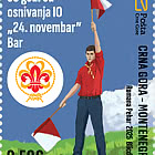
| 50th Anniversary of the Founding of the 24th November Bar Scout |
| Issued: 24.11.2025 |
| ›Montenegro |
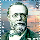
| Krisjanis Valdemars |
| Issued: 02.12.2025 |
| ›Latvia |
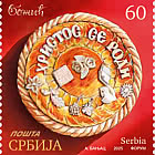

| Sign Language - Good |
| Issued: 02.12.2025 |
| ›Bosnia and Herzegovina - Republic of Srpska |

| In Memory of the Fallen and Murdered on October 7, 2023 |
| Issued: 08.10.2025 |
| ›Israel |
| Annual Collection Folder (New York) |
| Issued: 05.12.2025 |
| ›United Nations |
| Year Set |
| Issued: 24.11.2025 |
| ›Isle of Man |
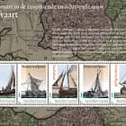
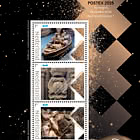
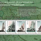
| Shipping in the 17th and 18th Centuries - Peat Shipping |
| Issued: 05.12.2025 |
| ›Netherlands |