WorldPride Amsterdam
| Sheetlets |
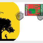
| First Day Cover |
| Presentation Pack |
| Stamp Booklet |
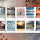
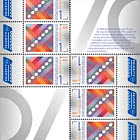
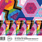
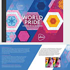
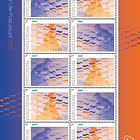
On 1 April 2026 PostNL will issue the WorldPride Amsterdam 2026 stamp sheet. WorldPride is a global event that promotes visibility and awareness of LGBTQIA+ issues. PostNL chose 1 April 2026 because this date marks the 25th anniversary of the world’s first legal marriage between two people of the same sex, performed in the Netherlands. Graphic designer Martin Cadwallader created a colourful, kaleidoscopic design featuring geometric shapes for these WorldPride stamps. The denomination 1 applies to items up to 20 grams sent within the Netherlands. The price for a sheet of 5 stamps is €7.00.
SUBJECT
WorldPride Amsterdam 2026 takes place in the capital from 25 July to 8 August 2026, organised by the Pride Amsterdam Foundation. WorldPride is a global event held every few years in a different city, aimed at increasing international visibility and awareness of LGBTQIA+ issues. LGBTQIA+ is the abbreviation for lesbian, gay, bisexual, transgender, queer, intersex and asexual, with the + standing for all other identities. The first WorldPride took place in Rome in 2000. Amsterdam was awarded the event for 2026. A key reason was that, 25 years earlier on 1 April 2001, the city hosted the first official marriage between two people of the same sex, conducted by then‑mayor Job Cohen. During WorldPride Amsterdam 2026, numerous activities will take place, including parades, street festivals, concerts, film festivals and conferences. The 2‑week event will conclude on 8 August with the WorldPride March and the WorldPride Closing Concert on Museumplein.
DESIGN
The visual identity of this year’s WorldPride has been applied in a special way on the stamps WorldPride Amsterdam 2026. Each of the 5 identical stamps features 4 diagonal bands at a 30‑degree angle. In each band, graphic designer Martin Cadwallader created a kaleidoscopic interpretation of the colours and shapes of different flags used within the LGBTQIA+ community. Beneath each band is a separate graphic layer with motifs known from clothing and ceramics. These motifs originate from the Netherlands and from regions around the world from which communities have migrated to the Netherlands: Indonesia, Suriname, the Antilles, Morocco and Turkey. On the top sheet border, the 4 diagonal bands return in large format with different crops of colours, motifs and patterns. The bottom sheet border features the PostNL and WorldPride Amsterdam 2026 logos. Between the logos a reference is made to the fact that on 1 April 2026 it will be exactly 25 years since the first marriage between two people of the same sex was concluded in Amsterdam.
TYPOGRAPHY
The typography uses Pride Amsterdam’s house font, an adapted version of TT Fors from 2021, created by the international type design studio Monotype (with offices in Australia, Berlin, Hong Kong, London, Paris, Shanghai and Tokyo).
DESIGNER
Martin Cadwallader previously created designs for the Pride Amsterdam Foundation, including the logos and visual identity for EuroPride Amsterdam 2016 and Pride Amsterdam 2019. In 2025 he was again approached by the foundation, this time to design the visual identity for WorldPride Amsterdam 2026. “The new identity revolves around the theme unity,” Cadwallader says. “Unity is the key to combating intolerance. I expressed this through the concept of the ‘cultural kaleidoscope’, also known as the fan of cultures. The visual identity, as also applied to the WorldPride Amsterdam 2026 stamps, shows that everything is connected and that every culture is an essential part of the whole. Just like the colourful geometric patterns in a kaleidoscope that constantly form new shapes while remaining connected, symbolising unity in diversity.”
Flags
Cadwallader incorporated recognisable rainbow colours in the design. “Different flags are used in the LGBTQIA+ world,” he explains. “I refer to these in colour and shape. You can see, for example, the light blue and pink of the transgender flag and the dark red and dark blue of the bisexual flag. The yellow and orange of the lesbian flag also appear, as do shapes and colours from the Progress Pride Flag. The Progress Pride Flag includes coloured chevrons symbolising communities such as BIPOC (Black, Indigenous and People of Colour). These elements are visual references: I did not depict the flags literally — they are my interpretations. I also added new shapes such as hexagons and star‑shaped patterns, derived from the way images appear in a kaleidoscope. All colours have been softened slightly to avoid visual overload, as there is already a great deal happening on the stamp sheet.”
Patterns and motifs
Alongside the kaleidoscopic colours and shapes, the design features a striking layer of various motifs and patterns. Cadwallader: “Amsterdam is home to around 180 nationalities, representing many different cultures. I wanted to reflect this in the design. Shortly before receiving the commission, I had become fascinated by how motifs and patterns — in clothing or ceramics, for example — travel across the world, often through historic relationships or trade and migration routes.
For this design I selected motifs that show how the richness of all these cultures comes together in the Netherlands. These include motifs from pangi cloths from Suriname, the wanglo flower from Aruba and the hibiscus and monstera from Curaçao. You can also see batik kawung patterns from Indonesia, alongside geometric motifs from Morocco and Turkey’s national tulip. The pattern layer also includes traditional Dutch elements such as floral motifs and windmills inspired by Delft‑blue tiles, as well as contemporary imagery like Kissing Boys and Kissing Girls, referring to the diversity of love.”
Festive and playful
Cadwallader applied the kaleidoscopic forms exuberantly on the stamp sheet WorldPride Amsterdam 2026. “Kaleidoscopes are especially popular as toys for children. I therefore focused on a festive, playful character. The base pattern contains many motifs and colours, all of which return on the stamps. Creating the ideal composition on such a small surface was challenging. It came together when I placed the 4 sub‑patterns, derived from the 4 flags, diagonally at a 30‑degree angle, based on the hexagon from the base pattern. The 4 equal‑width bands run from bottom left to top right, with the two middle bands aligning with the outer bands of the stamps on the left and right. I applied the same approach on the sheet border, but at a larger scale and with different crops.”
Broken and reassembled patterns
On the stamps Cadwallader experimented with different crops and positions before he was satisfied. “I achieved this by breaking up and reconstructing the base pattern like a mosaic. My goal was a clear image in which all colours, motifs, patterns and shapes receive equal attention. I also had to consider the typography. The TT Fors font — Pride Amsterdam’s house font — is a slender, modest typeface with elegant curves. The denomination 1 therefore appears in a bold size so it doesn’t get lost among all the colours. I also wanted to prevent the white typography from disappearing against the white areas present in the base pattern. It required lots of trial and error.”
About the designer
British designer Martin Cadwallader (Birmingham, England, 1976) studied philosophy at the University of Southampton from 1993 to 1997. In his free time he played in a band, for which he also designed the website, album covers, flyers and posters. After graduating he did not pursue philosophy professionally but worked for various agencies in England as a programmer, animator, digital designer and brand identity designer.
In 2014 he moved to Amsterdam, becoming design director at VBAT, working for clients such as de Bijenkorf, the Concertgebouw, ING, PostNL, Pride Amsterdam and WPP. Since 2018 Cadwallader has worked independently as a brand identity and motion graphic designer, currently based in Lichfield, England.
Netherlands - Recommended stamp issues
WOPA+ recommended stamp issues

| Avatar - Fire and Ash |
| Issued: 03.12.2025 |
| ›New Zealand |
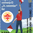
| 50th Anniversary of the Founding of the 24th November Bar Scout |
| Issued: 24.11.2025 |
| ›Montenegro |
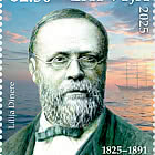
| Krisjanis Valdemars |
| Issued: 02.12.2025 |
| ›Latvia |

| Sign Language - Good |
| Issued: 02.12.2025 |
| ›Bosnia and Herzegovina - Republic of Srpska |

| In Memory of the Fallen and Murdered on October 7, 2023 |
| Issued: 08.10.2025 |
| ›Israel |
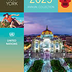
| Annual Collection Folder (New York) |
| Issued: 05.12.2025 |
| ›United Nations |
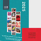
| Year Set |
| Issued: 24.11.2025 |
| ›Isle of Man |
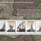
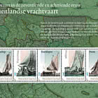
| Shipping in the 17th and 18th Centuries - Peat Shipping |
| Issued: 05.12.2025 |
| ›Netherlands |