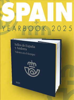
EUROPA - 70 Years PostEurop
| Sheetlets |

| Sheetlets |

| First Day Cover |

| Presentation Pack |

| Stamp Booklet |
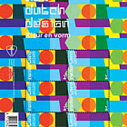
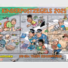
In 2026 the 70th anniversary of the EUROPA stamps will be celebrated, a philatelic initiative launched in 1956 to strengthen relations between European countries and promote unity. The first issue 70 years ago was produced by 6 countries: Belgium, Germany, France, Italy, Luxembourg and the Netherlands — the founding nations of what would later grow into the European Union. Today, more than 50 postal organisations in Europe issue EUROPA stamps each year around a joint theme. Since 2002 these issues have included a design competition: the EUROPA Stamp Best Design Competition, organised by PostEurop, the body in which all European national postal operators cooperate.
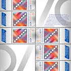
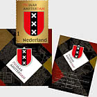
For the anniversary year 2026, PostEurop organised an internal competition to select a joint design motif for the EUROPA stamps, based on the theme United in. This theme emphasises the shared values of PostEurop members in areas such as communication, innovation, cooperation and shared heritage. The competition was won by Posti Ltd., the national postal operator of Finland. Based on the theme United in, PostNL is issuing the stamp sheet 70 years PostEurop on 8 May 2026. The winning Finnish design motif is included on every stamp as a mandatory element. The 6 identical stamps carry the denomination International 1 for items up to 20 grams with an international destination. The retail price for a sheet of 6 stamps is €12. The design was created by graphic designer Sandra Smulders from Gouda.
DESIGN MOTIF
The design motif on the 70 years PostEurop stamps was created by graphic designer Klaus Welp from Helsinki, Finland. Welp has been designing stamps for the Finnish postal operator for more than 20 years. In an explanation to PostEurop, he described how he used a combination of abstract and symbolic elements in his design: “The dotted diagonal refers both to the perforations of stamps and to the progress made through the work of PostEurop. The 7 dots connected by a straight line symbolise 70 years of joint effort by the postal organisations in Europe. The overlapping colours and dotted patterns in the background form a cohesive and lively whole. This reflects the cheerful mix of colours from European flags and symbolises the unity of all PostEurop members.”
DESIGN
On the 70 years PostEurop stamp sheet, the 6 stamps appear in two groups of three: 3 stamps in the upper left and 3 in the lower right. The lower stamps are rotated 180 degrees relative to the upper ones, which causes the 2 middle stamps to touch each other. All tabs feature the standard Priority logo. On each stamp, the square design motif prescribed by PostEurop appears on the left. This motif is composed of diagonal colour bands with various dotted patterns, crossed by an ascending diagonal line with 7 large dots. On the right side of each stamp there is space for all postal typography, the PostEurop logo and the sorting hook. The number 70 also appears there, with the second digit (0) split in half and running off the stamp. Behind the number 70 is a stylised graphic representation of fireworks. On the two touching stamps in the centre, the two halves of the 0 together form a complete 0.
On the sheet border, the number 70 appears in large size at the top right. The same number appears at the bottom left, rotated 180 degrees relative to the top. The two stems of the 7s meet in the centre of the sheet, below where the two stamps touch. Behind the 0s on the sheet border is the same fireworks pattern as on the stamps but enlarged. In the title at the top of the sheet, the shape of the number 70 is identical to that on the stamps and the sheet border. A short text explaining the reason for this issue appears at the top right. All number 70s, the fireworks and the borders of the sheet are printed in a special PMS silver colour with gradient, emphasising the platinum anniversary of PostEurop.
TYPOGRAPHY
For the typography on the 70 years PostEurop stamp sheet, two typefaces were used: D‑DIN regular, condensed and bold (2017) by Charles Nix, New York (for Monotype/Datto) and DINPro light (2005) by Albert‑Jan Pool, Hamburg (for FSI FontShop International). Both typefaces are variations on the DIN 1451 typeface from the Deutsches Institut für Normung (German Institute for Standardisation), created in 1931.
DESIGNER
The 70 years PostEurop stamp sheet was designed by graphic designer Sandra Smulders from Gouda. She also designed PostNL’s entry for the earlier PostEurop competition for the EUROPA stamps. The aim of that competition was to select a joint design motif for the theme United in. “All participating postal organisations are using this design motif for their EUROPA stamps this year,” Smulders explains. “That is, of course, a limitation for every designer, but I was very comfortable working with the Finnish winning motif. PostNL was also allowed to cast a vote, and the Finnish entry was in their top 3 favourites. The motif is square, which gives the freedom to choose between a horizontal or vertical stamp format. I chose a horizontal stamp on a vertical sheet, as that offered the best possibilities to depict the anniversary number 70 as large as possible.”
White frame
Smulders had to take additional requirements into account for the 70 years PostEurop stamps. For example, the D‑DIN typeface was mandatory for the country name, denomination and year. The EUROPA logo on the stamps and the Priority logo on the tabs also needed to be included. “The square motif could either be placed up to the perforations or with a white frame around it. I chose the frame, because it allows the motif to shine better. Without it, the overall look would have been too heavy. For the sheet border design, I had full freedom. PostNL did request a calmer design for the sheet border than for the motif, because the 2026 issue programme already includes many colourful stamp designs — otherwise it might become too much.”
Platinum anniversary
While creating her own entry for the shared design motif competition, Smulders had already developed several ideas for the sheet border. She incorporated some of them into the final design with the Finnish motif.
“I wanted an extra printing pass with a platinum colour on the sheet border and the stamp,” she explains. “A 70‑year anniversary is also known as a platinum anniversary. The silver that most closely resembles platinum is PMS 877C. I also wanted to include fireworks to emphasise the celebratory nature of the issue. I didn’t yet know exactly how.”
Symmetry
Smulders first determined the layout of the sheet, with 3 stamps at the top left and 3 at the bottom right. “Normally, international stamps appear in a row of 6, either vertically or horizontally. By separating them and rotating the lower set, the two middle stamps end up facing each other. That symmetry creates a central point in the design, which allowed me to echo the theme United in. I used this 3‑and‑3 division before in the stamp sheet 60 years André van Duin, but with the stamps in the lower left and upper right. So I knew it was technically possible.”
Free colour choice
Although the left‑aligned design motif and the prescribed postal information seem to leave little room for variation, Smulders still found possibilities. “For the word ‘International’ I used the slightly heavier DINPro light to distinguish it from the other typeface. I was also free in the colour choices. For ‘International’ and the denomination 1, I used the lilac‑blue from the Finnish motif’s background, with a gradient from light to dark. For the year 2026 and the word ‘Netherlands’, I chose orange the same shade as in the motif and a reference to the national colour and PostNL’s brand identity. The placement of all elements on the right strip came naturally, like assembling a puzzle. ‘International’ is the longest word, so I placed it vertically across the full height, with ‘Netherlands’ and the ‘1’ next to it. The strip is neatly framed on the short sides with the EUROPA logo and 2026 on one side, and the sorting hook on the other. The number 70 with fireworks appears in the right strip as well, but that was added only at the end.”
As large as possible
Because the stamps were placed top left and bottom right, room was created on the sheet border at the top right and bottom left for the number 70“and as large as possible”, Smulders adds. “The DIN typefaces didn’t work well at that scale, so I designed the 7 and 0 myself, naturally in DIN style and in the platinum colour. The number 70 was also rotated into the free space at the lower left. I especially enjoyed making the 0 perfectly round and letting it run off the sheet it creates a more interesting image. By extending the stems of both 7s and fading the colour to 0%, they end invisibly beneath the two middle stamps exactly under the point where the two half 0s on the stamps form a perfect circle.”
Everything in its place
Because Smulders designed the digits of the anniversary number herself, she was able to ensure that they aligned perfectly with the perforations of the stamps. “The 7 begins exactly at the upper right corner of the top and bottom stamps, and the 0 fits precisely with the centre perforations. Again, the puzzle fell into place beautifully. Once that worked, my thoughts returned to the fireworks. The design needed that festive element, also to bring the stamp and sheet border together. I made many versions of the fireworks, all in platinum. It was difficult until I arrived at this seemingly simple solution of continuous and broken white lines against a platinum background, both with a gradient. On both the sheet border and the stamp, the fireworks appear only halfway just like the 0 in the number 70. But, just as with the 0, there is only one place where the full fireworks image appears: exactly in the centre of the sheet.”
About the designer
Sandra Smulders (The Hague, 1974) studied advertising and presentation design at Nimeto Utrecht from 1991 to 1995, specialising in graphic design. After graduating she worked as a graphic designer and art director at the B2B agency Admix, the communications agency FPW, Manten Grafisch Ontwerpbureau and VDM Reklame, all in Rotterdam. In 2007 she founded the agency Vormgoed in Gouda as a graphic designer and art director. Smulders specialises in the design of logos, corporate identities and their associated communication tools. She works mainly for corporate clients. Her recent clients include engineering firm ABT, Europost, publisher DAVO and Willemstein Hoveniers.
Netherlands - Recommended stamp issues
WOPA+ recommended stamp issues

| Avatar - Fire and Ash |
| Issued: 03.12.2025 |
| ›New Zealand |
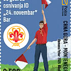
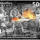
| 50th Anniversary of the Founding of the 24th November Bar Scout |
| Issued: 24.11.2025 |
| ›Montenegro |
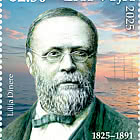
| Krisjanis Valdemars |
| Issued: 02.12.2025 |
| ›Latvia |

| Sign Language - Good |
| Issued: 02.12.2025 |
| ›Bosnia and Herzegovina - Republic of Srpska |

| In Memory of the Fallen and Murdered on October 7, 2023 |
| Issued: 08.10.2025 |
| ›Israel |
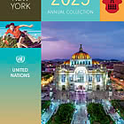
| Annual Collection Folder (New York) |
| Issued: 05.12.2025 |
| ›United Nations |
| Year Set |
| Issued: 24.11.2025 |
| ›Isle of Man |
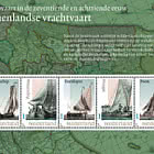
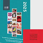
| Shipping in the 17th and 18th Centuries - Peat Shipping |
| Issued: 05.12.2025 |
| ›Netherlands |