2026Steam Locomotives - Sheetlets
- 28.09.2026
- Jan van Mechelen, Rotterdam
- Iwo Tuleya, Rotterdam
- Koninklijke Joh. Enschedé BV, Haarlem
- Offset
- Cyan, magenta, yellow, and black + phosphor
- Stamp Size: 30 x 40mm Sheet Size: 170 x 122mm
A steam locomotive is a railway locomotive powered by a steam engine. By boiling water using fuel (usually coal), high-pressure steam is produced. This steam moves pistons, which drive the wheels through a system of connecting rods. After the use of electric trains had been introduced throughout the Netherlands, the very last steam train journey took place in January 1958.
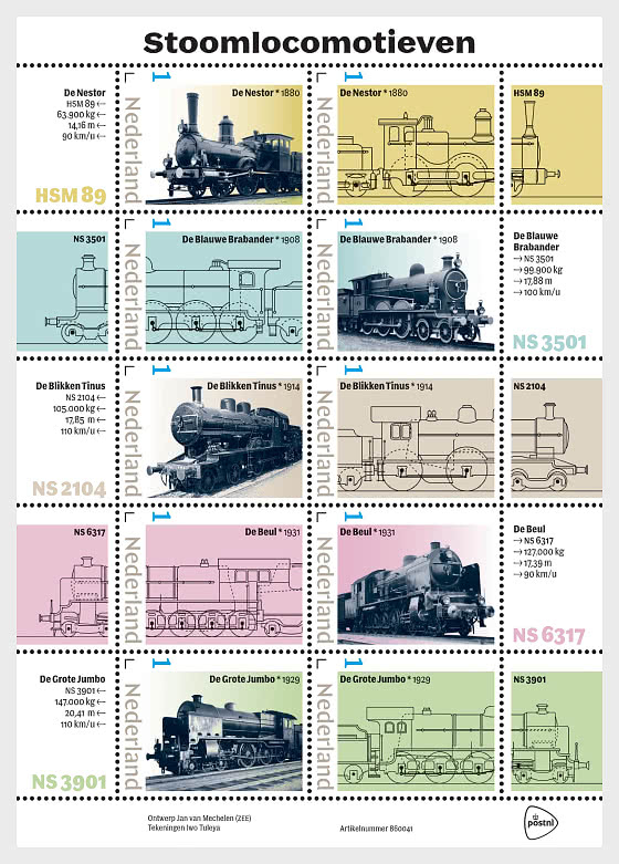
The stamps feature five different steam locomotives, each shown in two versions: a drawing and a photograph. They are the following steam locomotives.
De Nestor was built in Berlin in 1880 for the Hollandsche IJzeren Spoorweg-Maatschappij (HSM), at the time the only railway company in the Netherlands that gave names to its locomotives. De Nestor was also assigned the number 89. The locomotive is known for its wooden driver's cab. Its boiler could produce the high pressure of 10 atmospheres for that period, and the locomotive was designed for express train services. It could reach 90 km/h, was 14.16 metres long and weighed 63,900 kilograms.
De Blauwe Brabander is the name given to a series of locomotives built in Manchester in 1908 for the Noord-Brabantsch-Duitsche Spoorweg-Maatschappij (NSDS). They were the first locomotives in the Netherlands with three coupled driving axles and a boiler pressure of 14 atmospheres. They had to be fast and able to make up delays, as they were used as mail trains on the NSDS's own line via Boxtel, running between Vlissingen, where the mail boat from England docked, and Oberhausen in Germany. In 1919, operation of the Blauwe Brabanders was taken over by the Maatschappij tot Exploitatie van Staatsspoorwegen, which began working together with the Hollandsche IJzeren Spoorweg-Maatschappij (HSM) under the name Nationale Spoorwegen (NS). The Blauwe Brabander was then assigned the number NS 3500. It was characterised by its dark blue colour, finished with black bands and red lining. It weighed 99,900 kilograms, was 17.88 metres long and could reach 100 km/h.
De Blikken Tinus owes its nickname to the characteristic sound made by its rattling coupling rods at high speed. The locomotive was built in Berlin in 1914 for the HSM for fast international services and was later given the number NS 2104. Its wheels were exceptionally large, measuring 2.10 metres in diameter. Because these locomotives were not easy to operate, they were also used for driver examinations. De Blikken Tinus weighed 105,000 kilograms, measured 17.73 metres in length and could reach 110 km/h.
De Beul was built in Berlin in 1931 for the NS and was assigned the number NS 6317. The NS urgently needed more powerful locomotives, particularly in South Limburg, where increasing quantities of coal were being extracted from the mines. De Beul became the heaviest tank locomotive in Europe, but enormous quantities of coal were required to maintain sufficient pressure in the boiler. This meant that the stoker had to work extremely hard. This is why the locomotive was nicknamed ‘De Beul’. The huge locomotive weighed 127,000 kilograms, was 17.39 metres long and could reach 90 km/h.
De Grote Jumbo (NS 3901) dates from 1929 and was built in Kassel for the NS. More and more wooden passenger carriages were being replaced by steel carriages, creating a need for locomotives with greater tractive effort and power. In terms of the design of the boiler, cylinders and driver's cab, it was an enlarged NS 3700 with a more powerful boiler. The cylinders had a diameter of 420 mm instead of 400 mm. This increased both the tractive effort and the power by approximately 15 percent. Remarkably, De Grote Jumbo was also equipped with wind deflectors to prevent the wind from blowing smoke from the chimney into the driver's line of sight. This large locomotive weighed 147,000 kilograms, was 20.41 metres long and could reach 110 km/h.
Railway Museum
De Nestor is one of the highlights of the Railway Museum in Utrecht, and De Blikken Tinus can also be viewed there in its entirety. De Beul forms part of the indoor attraction ‘Stalen Monsters’ (Steel Monsters) and can therefore only be seen from a small vehicle passing quickly alongside it. A 1:10 scale model of the Blauwe Brabander is on display. De Grote Jumbo is not on display, but its smaller predecessor, Jumbo, can be seen there.
DESIGNStamp Sheet
Designer Jan van Mechelen carried out extensive research, reading widely and initially selecting 10 steam locomotives. “I was looking for a good variety and, of course, also considered whether good images of a particular locomotive could be found. I then checked with the Railway Museum to make sure that my selection was historically and substantively relevant. In consultation with the Railway Museum, two locomotives in my selection were replaced.
“During my research, I also came across many interesting technical drawings, and I wanted to incorporate these into the design, both for their visual and their informative value. I therefore decided to select five locomotives and show each one both as a photograph and as a drawing.
“I wanted to make full use of the entire stamp sheet, which led me to five horizontal strips. For each drawing, the front of the locomotive extends into the sheet margin, while the other side of the strip contains textual information in the margin. I allowed the perforations to continue across the entire width of the stamp sheet.
“I hope that someone who needs two stamps will stick the entire strip onto the postal item, allowing the image of that particular locomotive to remain intact across its full width. The locomotives alternate direction from one strip to the next, so that the photographs and drawings do not appear directly underneath one another.”
Stamps
“I searched for photographs in which the locomotives were shown from more or less the same angle, either from the front left or the front right, because I wanted to alternate the direction on the stamp sheet without mirroring the photographs themselves.
“Because the images differed considerably in quality, I isolated the locomotives from their backgrounds and increased the contrast, creating a strong graphic image. The locomotives are printed in a dark steel blue, which makes them particularly striking.”
Illustrations
“I found most of the original drawings at the Utrecht Archives, where I received excellent assistance. To create a consistent visual style, I had new drawings made by Iwo Tuleya using different line weights, from which I selected one.
“These drawings also partly show the corresponding tenders, the trailers behind the locomotives that carried the large quantities of coal and water required.
“I also considered depicting ornaments from the corresponding trains, but ultimately this felt forced, so I abandoned the idea.”
Colours
“I researched which colours were historically appropriate for this subject. Many railway companies used green or copper tones as part of their corporate identity. I supplemented these colours using shades from the same palette.”
Typography
Van Mechelen used the Murtaugh typeface, designed by Nikola Djurek for Typotheque, a type foundry in The Hague where designers can license typefaces. The font is a modern interpretation of the nineteenth-century Latin style.
“A traditional old-fashioned typeface cast in steel would initially seem appropriate, but it would be too old-fashioned. Murtaugh is a modern typeface, but with a clear nod to the past. It is an elegant typeface available in six weights and two widths: Normal and Condensed. For this stamp sheet, the narrow version is used predominantly. Only the title is set in the normal width.
“The numerals are beautifully designed, and the font is particularly suitable for giving a historical subject a contemporary feel.”
Netherlands - Recommended stamp issues

WOPA+ recommended stamp issues

| Avatar - Fire and Ash |
| Issued: 03.12.2025 |
| ›New Zealand |
| 50th Anniversary of the Founding of the 24th November Bar Scout |
| Issued: 24.11.2025 |
| ›Montenegro |
| Krisjanis Valdemars |
| Issued: 02.12.2025 |
| ›Latvia |

| Sign Language - Good |
| Issued: 02.12.2025 |
| ›Bosnia and Herzegovina - Republic of Srpska |

| In Memory of the Fallen and Murdered on October 7, 2023 |
| Issued: 08.10.2025 |
| ›Israel |

| Annual Collection Folder (New York) |
| Issued: 05.12.2025 |
| ›United Nations |
| Year Set |
| Issued: 24.11.2025 |
| ›Isle of Man |
| Shipping in the 17th and 18th Centuries - Peat Shipping |
| Issued: 05.12.2025 |
| ›Netherlands |