2026Marketing - Sheetlets
- 21.09.2026
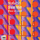
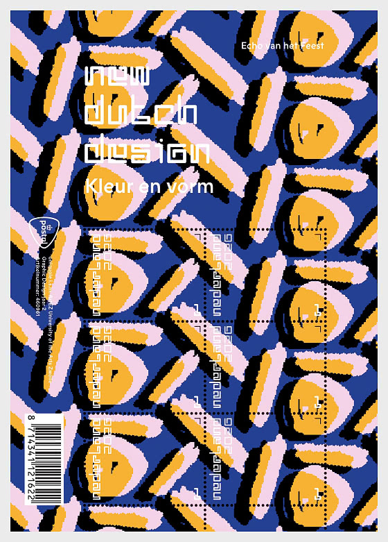
On 28 September 2026, PostNL will issue the New Dutch Design Echo of the Celebration stamps, the fourth and final stamp sheet of this year in the New Dutch Design series. The series showcases the work of the future generation of Dutch graphic designers. The design of these stamp sheets was created during the 2024-2025 academic year by second-year Graphic Design students at ArtEZ in Zwolle, in collaboration with Nicole Uniquole. The stamps bear denomination 1 for mail up to and including 20 grams destined for addresses within the Netherlands.
This year, the New Dutch Design series is once again dedicated to the theme of ‘celebration’, expressed through colour and form. Each year, every cohort of second year students is given the freedom to interpret this theme in its own way. For the 2025 stamps, the students explored the theme through various ‘rituals’. For the 2026 stamps, the new cohort of students chose the prompt ‘go all out’ following a brainstorming session. Through four different stamp designs, they invite us, as they themselves describe it, to pause, let go, remember and, above all, celebrate existence.
The fourth issue, released on 28 September, is a sheet featuring 6 special stamps in 2 different designs and is entitled Echo of the Celebration. Earlier this year, the stamp sheet Recurring Memories was issued on 16 February, followed by Taste the Atmosphere on 8 May and Glow of the Moment on 10 August. The stamps bear denomination 1 for mail up to and including 20 grams destined for addresses within the Netherlands. The price of a sheet of 6 stamps is €8.40.
DESIGN
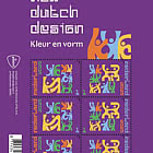
The New Dutch Design Echo of the Celebration stamp sheet is dominated by a large flowing graphic illustration featuring manipulated dashes and dots. The shapes within the pattern continue across the perforations from one stamp to the next. The pattern also extends into the sheet margin. The illustration depicts confetti left behind after a celebration. The colours have been selected from this year’s fixed palette for the New Dutch Design series.
DESIGN PROCESS
The designs for the four issues in the 2026 New Dutch Design stamp series were created during the 2024-2025 academic year by second-year Graphic Design students at ArtEZ in Zwolle. All 21 students in this cohort contributed extensively to the concepts and designs for the series. On behalf of PostNL, curator Nicole Uniquole guided the students through the design process, including inspiration sessions at the start and a visit with the students to the National Archives. The design process of virtually every Dutch stamp has been documented there.
The educational project was based on the principle that the stamp sheets should form a coherent series while giving students every opportunity to develop their creativity. The project fits within ArtEZ's policy of collaborating with external partners and encouraging students to experiment freely. At ArtEZ, the students were supervised by Marijke Meester and Anje Jager, Head of Graphic Design and Graphic Design Lecturer respectively. The students worked together as one large design studio, gaining experience in all aspects of the profession, from briefings, brainstorming sessions, concept development and client presentations to colour selection, typeface selection, combinations of text and visual design, and the development of other materials. During the first phase of the project, the students were divided into groups to develop concepts and present sketches to PostNL and Nicole Uniquole. The selected design concepts were then further developed by newly formed student groups into preliminary and subsequently final designs. At the same time, other groups worked on typography, the colour palette, and the texts and design for the accompanying presentation folder.
TYPOGRAPHY
The typography uses two typefaces. The first is Vier, a typeface designed in 2025 by ArtEZ student Maureen Ketting for the first stamp issue in the New Dutch Design series. The second is Prophet, a sans-serif typeface from 2016 by Johannes Breyer, Fabian Harb and Erkin Karamemet of Dinamo Typefaces in Berlin.
NICOLE UNIQUOLE ON THE PROJECT
The design of the New Dutch Design – Echo of the Celebration stamp sheet was created during the 2024-2025 academic year by second-year Graphic Design students at ArtEZ in Zwolle, in collaboration with Nicole Uniquole. What Nicole Uniquole values most is the opportunity to guide the next generation of graphic designers through a real-world project.
“This is not an exercise on paper, but a PostNL stamp that will soon be available in shops. I enjoy introducing students directly to professional design practice: real deadlines, real choices and real impact. In this project, you are not only a guest lecturer but also the client. For the students, this combines portfolio work and practical experience in one project: an official stamp on their CV that people across the Netherlands will use to send post. Education and practice come together here. You can see the new generation of designers grow as soon as their concepts move towards production. The fact that I can offer them this opportunity together with PostNL is something I truly love.”
DESIGNERS
The New Dutch Design series brings the 2026 theme ‘celebration’ and the subtheme ‘go all out’ to life through colourful and multifaceted forms. The stamp sheets are characterised by exuberant patterns and expressive visual language inspired by moments of nostalgia, togetherness, light and longing. This year’s final issue is the New Dutch Design – Echo of the Celebration stamp sheet, through which the designers draw attention to the moment after the partygoers have left, just before the clean-up begins.
ALL SORTS OF IDEAS
On behalf of their fellow students, Aliesje de Blok, Ocean Silvernberg and Soof van de Weg explain how the design came about.
“During the concept phase, our group developed all sorts of ideas based on notions such as atmosphere and moment,” says Aliesje de Blok. “One of those ideas was ‘echo of the celebration’. It fitted perfectly with PostNL’s brief to develop concepts around the main theme of celebration. We were less interested in the party itself. Instead, we wanted to show what is left behind after a celebration: empty bottles, crumpled cups, dirty glasses, wilted flowers, a smouldering barbecue or confetti scattered across the floor.”
COMPLETE FREEDOM
The ideas and concept proposals were presented to lecturers and fellow students in several rounds.
“We received feedback every time,” says Soof van de Weg. “PostNL also provided regular feedback. They gave us complete freedom as designers to do our own thing, but they were extremely helpful in refining the themes. During the concept phase we were free to explore any direction we wanted. That does not mean they agreed with everything, but they always explained very clearly why they felt a certain way. That allowed us to move forward.”
DIFFERENT PERSPECTIVES
Once the ‘echo’ as a symbolic remnant of a celebration had been selected as the most promising concept, all students were divided into new groups.
“Each newly formed group included a student who had previously been involved with the concept and could therefore explain the underlying idea,” says Ocean Silvernberg. “Every group then set about developing and presenting concepts from different perspectives. In my group, for example, the confetti idea was explored through photography. We cut pieces and streamers from crepe paper ourselves and photographed them. We then used the images on a computer to create all kinds of patterns in different colours. Another group took a completely different approach by visualising the echo of a celebration literally, using sound waves as inspiration.”
A POSITIVE TWIST
The groups continued developing a range of earlier ideas.
“We were interested in exploring what we could do with wilted flowers,” says Soof van de Weg. “But without context that concept was not easy to understand. That is why the emphasis shifted towards the enjoyment of the party rather than the fact that it had ended. In other words, a positive twist. At one point we also took a camera to a real party organised by a student in a higher year. At the end of the evening, while everything was being tidied up, we photographed everything that was lying on the floor. You start looking at the streamers, confetti and all the other discarded items in a completely different way. You also begin to notice how all the elements within the images interact with one another.”
STRIPES AND DOTS
That visit to the party provided a great deal of inspiration for the final design.
“It brought us closer to the essence of a party that has ended,” continues Soof van de Weg. “We first created sketches based on photographs of the party and photographs of handmade confetti. After that, I started drawing lines and dots in my sketchbook to represent confetti. Those sketches were then crumpled up and manipulated into patterns. What happens when you mix all those lines, circles and shapes together? At the time I had a very poor laptop that kept crashing, but strangely enough the results suddenly looked really cool. We created many different versions in order to make the forms as visually exciting as possible.
They suggest confetti, but not in a literal illustrative way. The shapes became increasingly abstract until only the essence of the pattern remained, as a creative interpretation of the confetti concept. The design is characterised by a contemporary pixel style, which is often seen as elusive. The pixels also come across beautifully on the printed stamps.
To be honest, we did not expect PostNL to choose this design. The fact that they did was fantastic. They were willing to take the risk. They also supported our choice of digital colours. The colours come from the palette used for the entire series, but each New Dutch Design 2026 stamp sheet has its own colour combination and atmosphere. One is more subdued, another warmer, while this one is brighter and more vibrant.”
THE SPIRIT OF THE TIMES
The student designers invested a great deal of work, from the first photographs of confetti on the party floor to the pattern that now appears on the stamp sheet in this distinctive style.
“Really brilliant,” says Aliesje de Blok. “If you compare all four stamp sheets from this year, this one is definitely the most contemporary. And it does so in a very bold design. In that sense, it reflects the spirit of the times and what currently interests young people in graphic design. This is how people of our generation see the world today.”
Netherlands - Recommended stamp issues

WOPA+ recommended stamp issues

| Avatar - Fire and Ash |
| Issued: 03.12.2025 |
| ›New Zealand |
| 50th Anniversary of the Founding of the 24th November Bar Scout |
| Issued: 24.11.2025 |
| ›Montenegro |
| Krisjanis Valdemars |
| Issued: 02.12.2025 |
| ›Latvia |

| Sign Language - Good |
| Issued: 02.12.2025 |
| ›Bosnia and Herzegovina - Republic of Srpska |

| In Memory of the Fallen and Murdered on October 7, 2023 |
| Issued: 08.10.2025 |
| ›Israel |
| Annual Collection Folder (New York) |
| Issued: 05.12.2025 |
| ›United Nations |
| Year Set |
| Issued: 24.11.2025 |
| ›Isle of Man |
| Shipping in the 17th and 18th Centuries - Peat Shipping |
| Issued: 05.12.2025 |
| ›Netherlands |